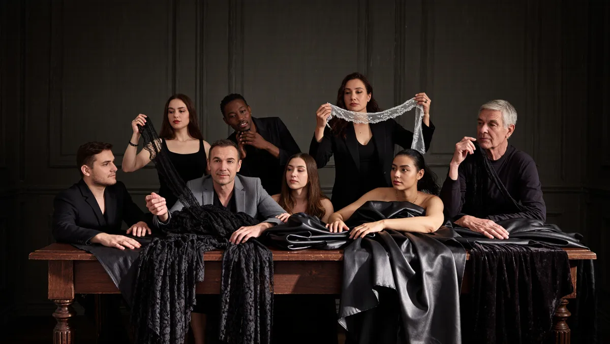
Every runway season has a color story. It rarely happens by accident. Houses build a palette the way they build a silhouette. The rules come from color theory. That is the long-standing body of knowledge about how colors mix, contrast, harmonize, and carry meaning.
The payoff shows on the runway. Fashion weeks display new collections and influence trends for the current and approaching seasons. A dominant hue that reads clearly from far away does real work. Here is how a season's palette gets built.
What Color Theory Actually Describes
Traditional color theory describes the behavior of colors. It covers mixing, contrast effects, harmony, schemes, and symbolism. It leans subjective and artistic. Color science stays more objective and functional. The two have long fed each other. For a designer, the practical core is simple. The ratios of colors must be consistent, and often exact. A palette that drifts from its ratios reads muddy, not bold. This is why a palette starts on paper, as ratios and schemes, before any cloth is ordered.
How a Dominant Hue Is Chosen
A season's dominant shade is picked first. Everything else is arranged around it. Color harmony is the discipline here. A palette built on a few related families reads calmer than one built on many. So the supporting tones sit close to the dominant hue. Some seasons run on one family. Others run on two that sit near each other. The fewer the families, the calmer the read.
Symbolism matters too. A color carries meaning before a single garment is read. Common craft practice follows from that. Commit to the dominant shade. Support it with its neighbors. Hold the accents for a few looks. The collection then keeps one clear voice from first walk to last. The runway itself pushes in the same direction. Buyers and press read a season's colors fast, from far away, and through a phone screen. A dominant hue has to survive all three. Subtle shades need a neighbor to lean on, and accents need space around them to land.
Why Contrast Makes the Accent Work
The accent works because of contrast. Eighteenth-century theory put special weight on "complementary", or opposing, hues. Such pairs show up in color afterimages and in the contrasting shadows of colored light. Michel Eugène Chevreul set out the law of simultaneous color contrast in 1839. Johann Wolfgang von Goethe's Theory of Colours appeared in 1810. Both works still anchor the field. The lesson for a runway is direct. An opposing hue placed beside the dominant shade makes both look stronger. That is why one small accent can carry a whole palette. Swatch or runway, the same pair of opposing hues does the same job. It makes the eye stop. This connects to our earlier piece, Look One Is Never an Accident: How a Show's Running Order Is Built.
Light Decides What the Audience Sees
Isaac Newton showed that white light is made of a spectrum of colors. He also showed that color is not intrinsic to objects. It arises from the way an object reflects or absorbs different wavelengths. On a runway, that physics is unavoidable. Show lighting changes how every dye reads. A palette proven under studio light still gets checked under the show's own lamps before the collections reach the runway. A house that skips this step finds its dominant hue shifted on the night. Testing the cloth under real lighting is the cheapest insurance a palette can buy.
Conclusion: A Palette Is an Argument
A season's colors are chosen, not found. The dominant hue states the idea. Harmony keeps the supporting tones in line. A complementary accent sharpens the scheme. Lighting decides what the audience actually sees. Color theory is old. On the runway it stays a working tool. It makes a collection say one thing at a glance. For related coverage, see How a Runway Cast Is Built: Go-Sees, Exclusives and the Season's Math.